Work
•
Fruit Forward: A Little Summer, Year-Round
A beverage concept built around one simple idea: make it feel like summer. Identity, custom illustration, packaging, and campaign thinking developed as one cohesive visual system.
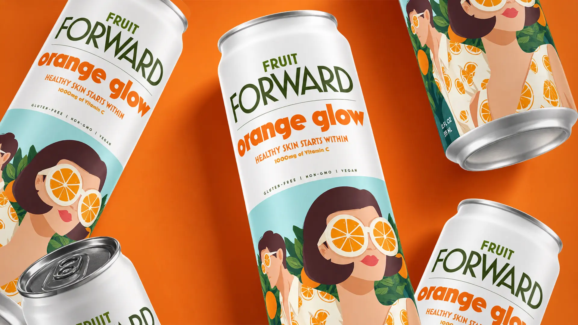
Last year, I was asked to help turn a new beverage concept into a full design system built around one simple idea: make it feel like summer.
That became Fruit Forward.
I worked closely with the team to build a cohesive visual system across identity, typography, custom illustration, packaging, and campaign work, all working together instead of as separate pieces.
Process
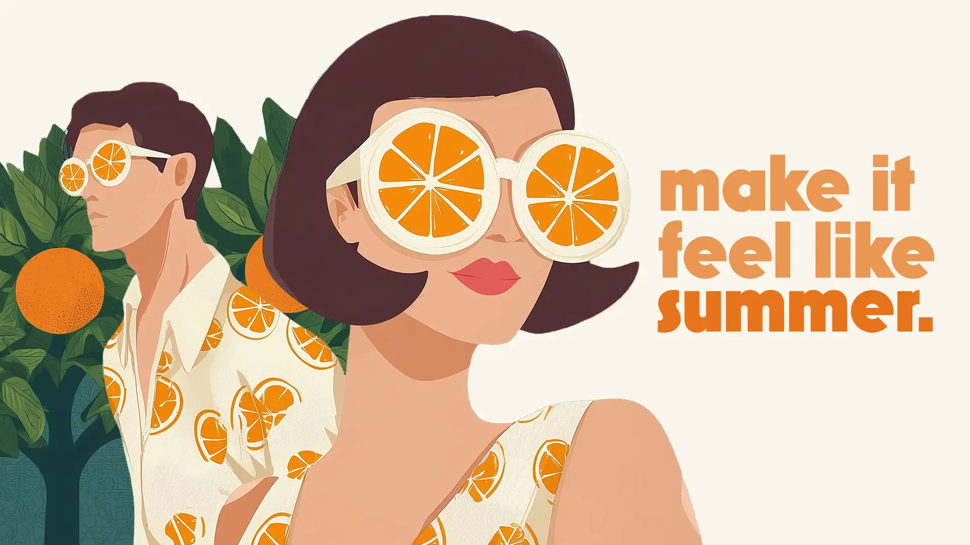
The illustration became one of the anchors of the identity: two characters, oversized citrus glasses, patterned clothing, and an orange grove that could extend well beyond the can itself.
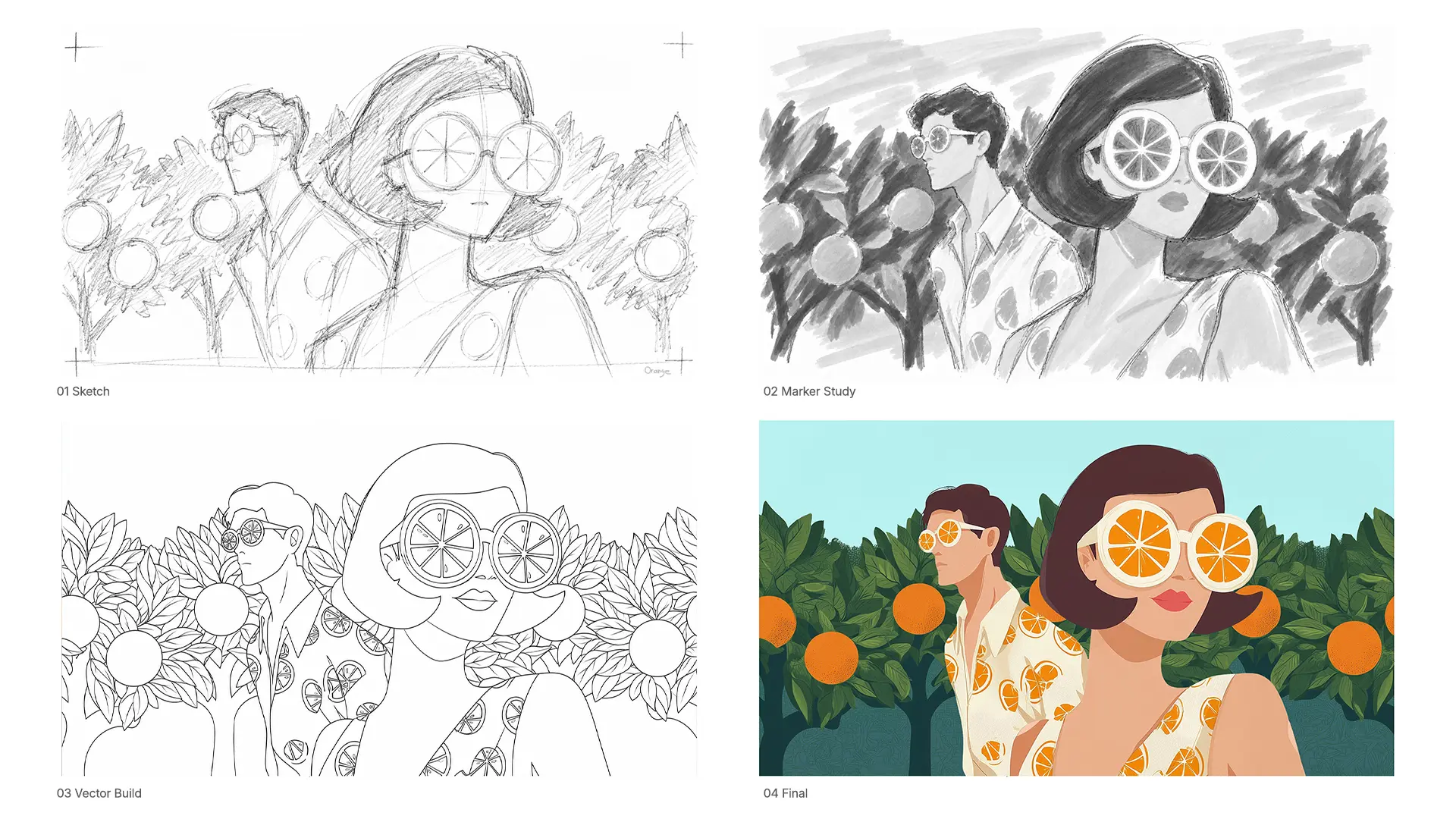
I took the composition from loose blocking and value studies through vector refinement, while keeping the personality of the original idea intact.
Packaging
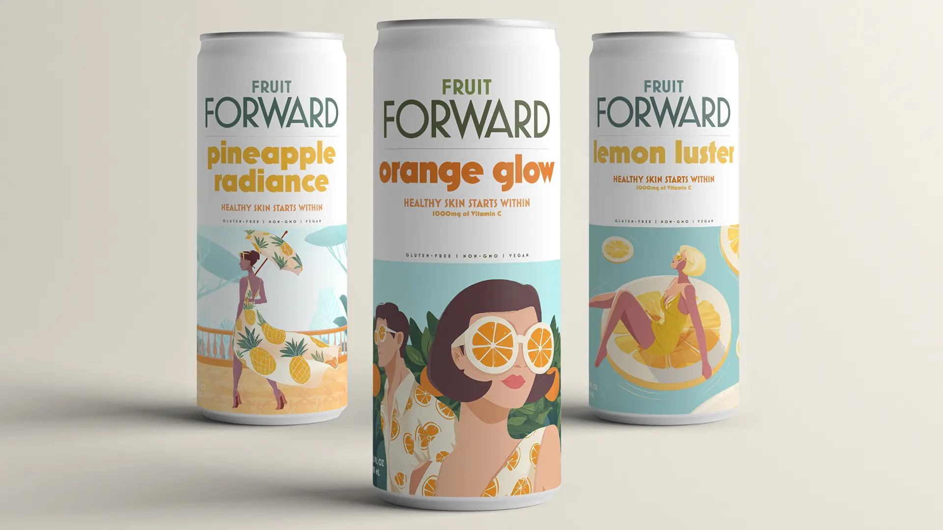
Orange Glow became the clearest expression of the system and a good place to establish how the typography, illustration, color, and packaging could work together.
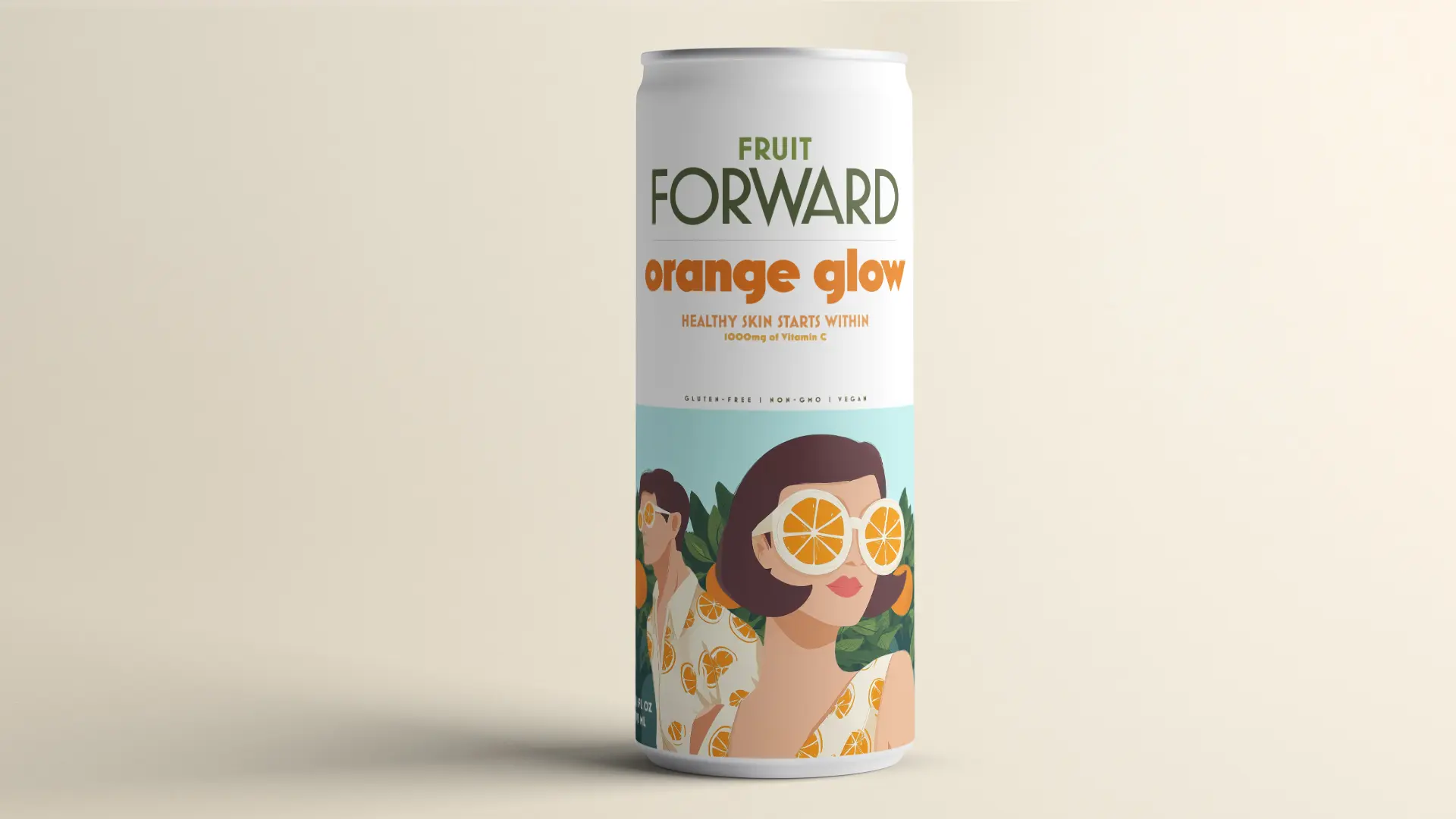
From there, the challenge was giving each flavor its own personality while keeping the family unmistakably Fruit Forward.
Campaign
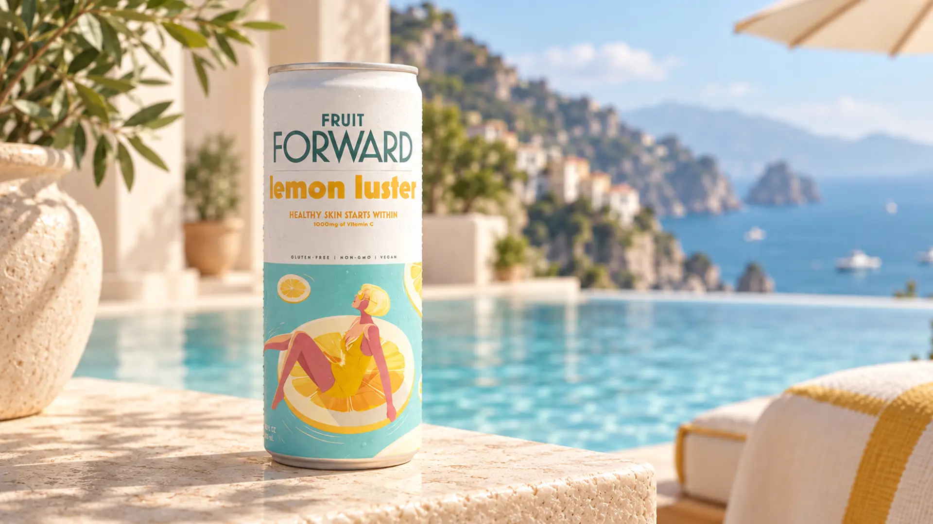
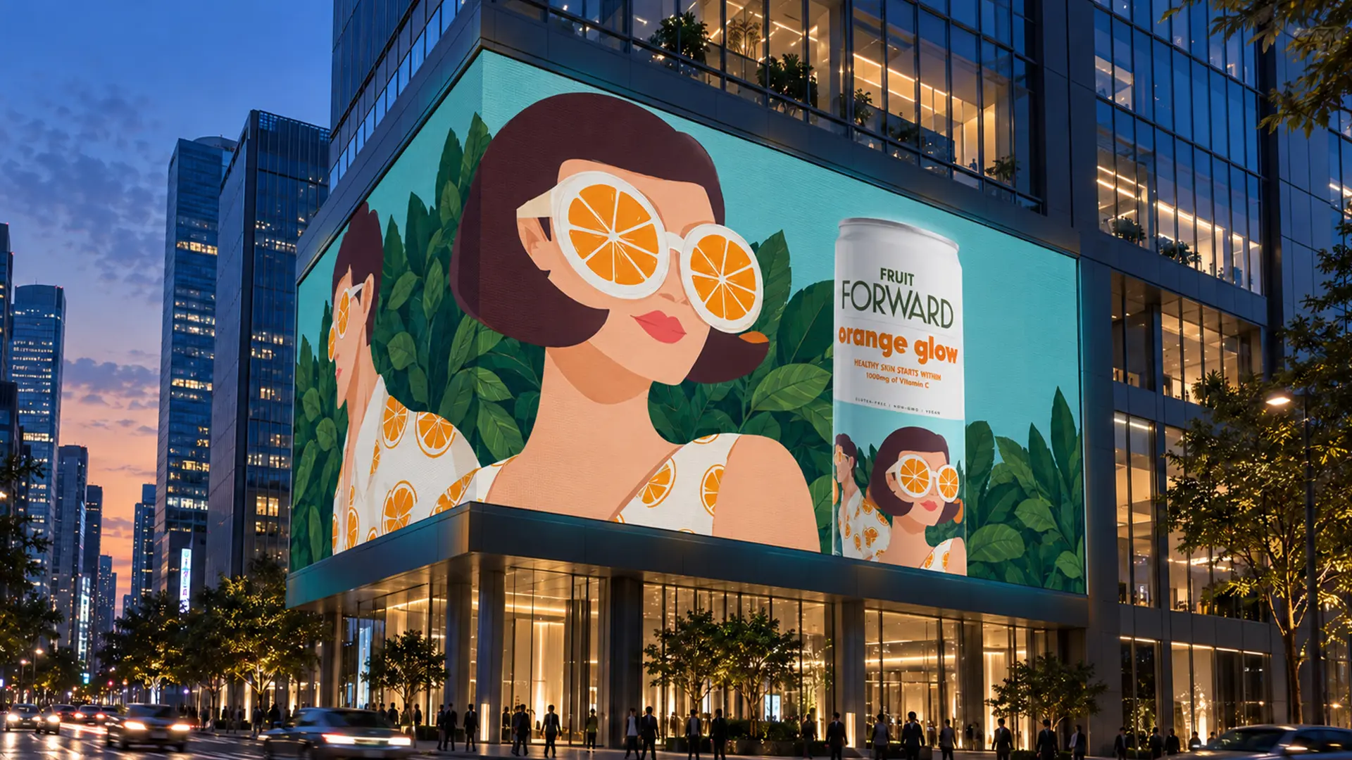
The fun part was seeing how far that same visual language could stretch, from packaging to lifestyle to OOH, without losing its personality.
And to be honest, there's something a bit personal about this, too. I'm always trying to make the work I do feel like a little bit of summer fun, year-round.
Thanks for looking. Stay in touch.