CASE STUDY · SELF-INITIATED CONCEPT
Usage rights, visible on the work.

OVERVIEW
ROLE
Creative Direction
Product Design
Identity Design
Interface Design
AI Art Direction
CREATOR
Jason Whittemore
Bounds is a visual rights concept that brings image usage terms into the creative review. Territory, channels, talent permissions, and expiration dates become visible alongside the asset, helping reviewers understand what’s covered and what needs attention.
THE CHALLENGE
Bounds started with a question I’d heard in too many reviews: “Are we cleared to run this in Canada?”
The creative was in front of us, but the answer required digging through a contract. Usage terms lived in documents, spreadsheets, and email threads, separate from the work being reviewed.
The challenge was to bring that information into view without burying the image beneath competing alerts.
CREATIVE STRATEGY
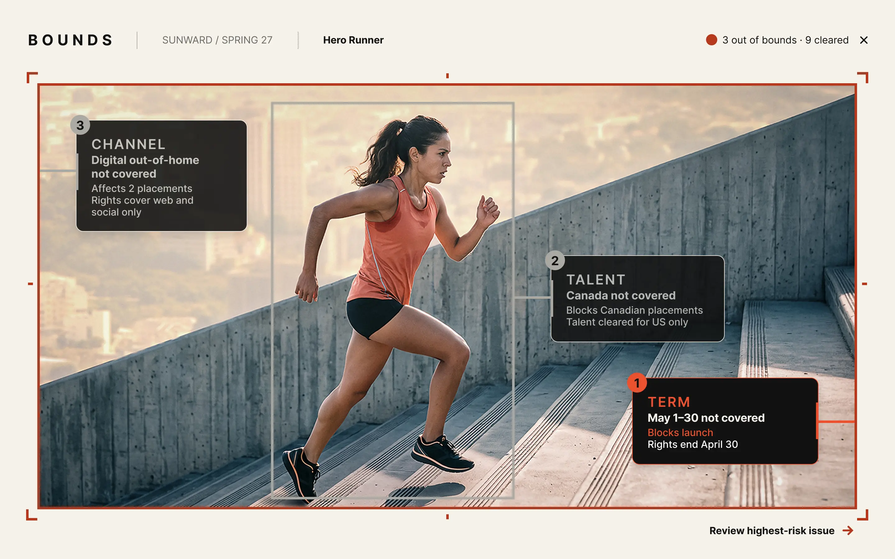
I designed Bounds around two connected layers: annotations on the image show what needs attention, while a detail panel explains the restriction, its source, and the next action.
The visual system separates status from priority. Symbols and plain language communicate whether a use is cleared, expiring, or out of bounds. Among unresolved issues, the strongest emphasis goes to the one with the greatest impact on the planned campaign.
KEY CREATIVE DECISIONS
01
Prioritize the most consequential issue
Rank restrictions by their impact on the planned campaign. Give the highest-risk issue the strongest emphasis while keeping lower-ranked issues visible.
02
Make every state understandable beyond color
03
Give each view one clear primary action
Connect the visible issue to a focused detail panel. Explain the coverage gap, identify its source, and offer a primary next step with relevant alternatives.
THE EXPERIENCE
The ranch campaign demonstrates the central idea: an image can look ready to use while carrying restrictions that aren’t visible in the creative itself.


The runner campaign demonstrates a more urgent state. Multiple restrictions remain visible, but the coverage gap receives priority so the reviewer knows where to start.
Before · Everything flagged

After · Ranked by risk
THE SYSTEM
Selecting the term issue opens a panel that turns “May 1–30 isn’t covered” into a visible gap on the campaign timeline.
The panel connects the restriction to its source clause, records who last verified it, and makes assignment status explicit. A request for an extension is the primary action, with options to shorten the campaign or replace the asset.
The identity uses restrained typography, boundary marks, and compact callouts to keep attention on the creative.
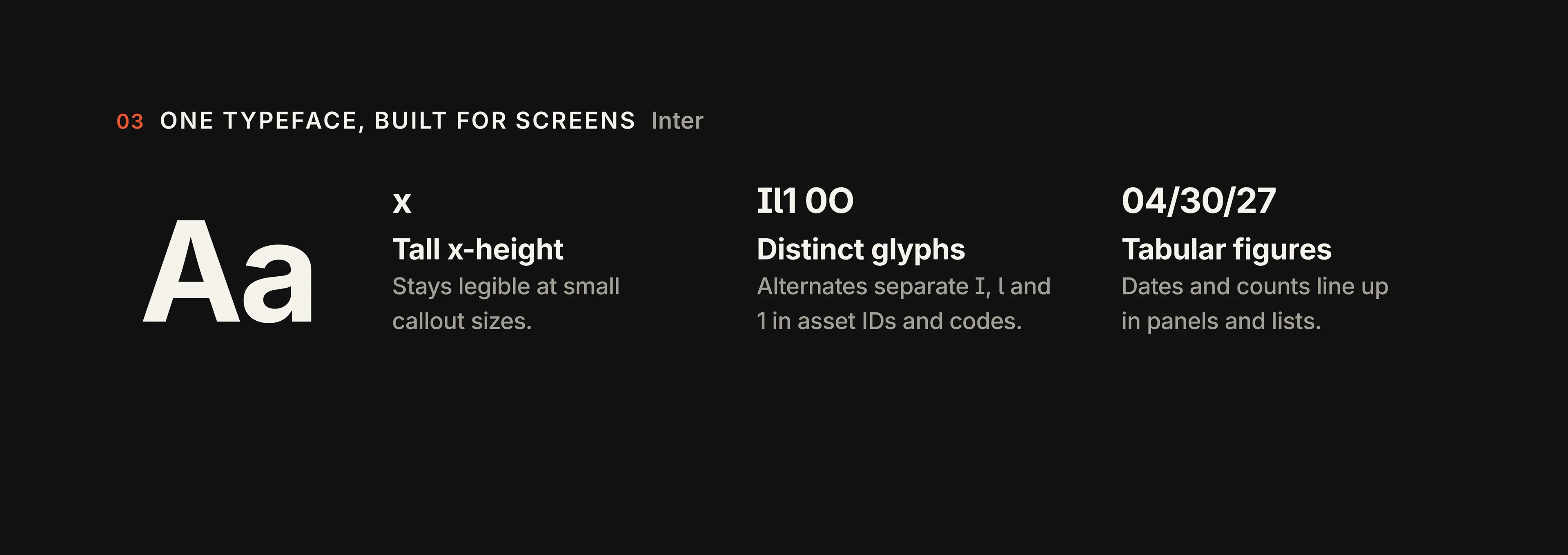
Status colors work alongside symbols and words. Orange provides emphasis on dark surfaces, while a darker brick tone carries that emphasis on light backgrounds. Inter provides a consistent type system for headlines, annotations, dates, and supporting details.
Accessibility shaped the system from the first decision. A screen full of red alerts can overwhelm someone with ADHD instead of helping them start, and a status that changes only from red to green fails anyone who can’t tell those colors apart. So Bounds limits emphasis to the issue that matters most and never relies on color alone. Every color pairing meets WCAG AA contrast.


CREATIVE DIRECTION & EXECUTION
I developed the premise, identity, interface concepts, and case-study narrative. I also art-directed the AI-generated campaign imagery to give the system two distinct creative contexts.
The scope remained focused on reviewing an asset, understanding its restrictions, and identifying the next action.
OUTCOME
Bounds brings a focused concept to life through a visual identity and connected interface states – from identifying restrictions to showing a campaign cleared for its planned use.
The intended value is straightforward: make usage terms easier to see, trace, and act on while the work is being reviewed.
WHAT’S NEXT?
Speed: test whether reviewers find the highest-risk issue faster than they do with spreadsheets.
Escalation: if a renewal deadline passes while an image is still in use, the clock becomes a ranked issue.
Live placements: escalate expiring rights earlier when they affect work that’s already running.

Bounds is a self-initiated design concept. Campaign imagery was generated with AI and refined in Photoshop.
Thanks for looking. Stay in touch.